BAMPFA AR
Designing the interactions and UI for an augmented reality museum exhibit iPad app.
Role
UI, Interaction Designer

OVERVIEW
BAMPFA AR was an interactive AR exhibition on the history of the Berkeley Art Museum and Pacific Film Archive (BAMPFA) building, exhibited in the BAMPFA in December 2019. It was created by the Berkeley XR group.
I was brought in to assist with the UI and interaction design of the augmented reality iPad app for the exhibit. In the 3 weeks before the exhibit opened, I polished the app’s UI and interactions to make an overall more intuitive and engaging experience for viewers.
BACKGROUND
The BAMPFA AR: Augmented Time exhibit aimed to inform museum visitors about the history of the museum’s building and how it has changed over time before it eventually became home to the BAMPFA.
To participate in the exhibit, museum-goers borrowed an iPad from the front desk, and then proceeded to their chosen experience. There were 2 main experiences a visitor could choose from: the 3d model experience and the amphitheatre experience.
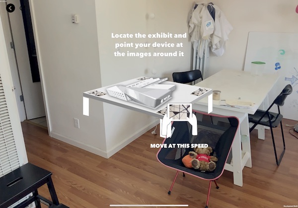
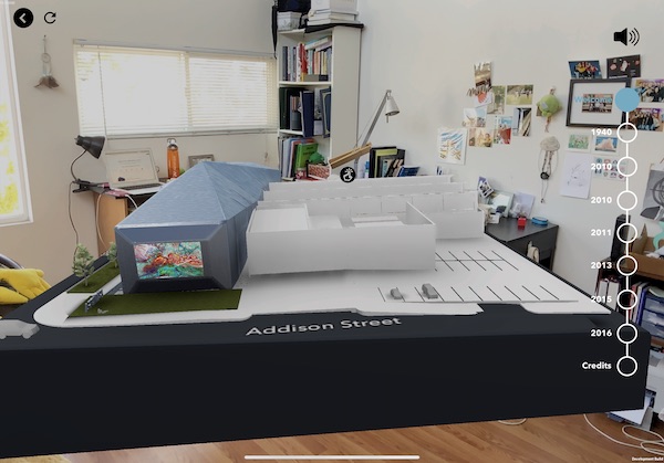
The 3D model experience featured a physical model of the museum, onto which the AR app projected a 3D rendered model. It then took viewers through an interactive history of the building.
The amphitheatre experience featured a video about the people involved with the museum throughout history, to be watched in the amphitheatre area.
THE MUSEUM-GOER JOURNEY:

THE TASK
My work was split into two parts: creating an onboarding guide for the 3D model and amphitheatre experiences, and redesigning the navigation UI + interactions for the 3D model experience.
PROJECT 1: ONBOARDING
I was in charge of planning and animating onboarding sequences for both experiences. Previous tests done by the Berkeley XR group showed that visitors had difficulty understanding how scanning the markers worked in relation to the exhibition, and thus needed a thorough onboarding sequence to reduce confusion.
THE PROBLEM
The onboarding for the AR experiences were either out-of-date or nonexistent, and didn’t clearly explain how to interact with the exhibit using the app.

Above: the previous onboarding sequence for the 3D model.
THE GOAL: ONBOARDING
I wanted to create an immersive, interactive onboarding experience that would actively walk people through the process of using the app.
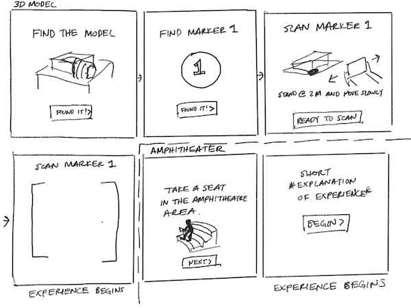
My first course of action was to split up the process into multiple steps, rather than just showing all the information at once. I did so by sketching a storyboard for each experience:

By breaking things into smaller steps, I hoped to reduce risk of cognitive overload. Making the process into steps also enabled me to add parts where the viewers would have to actively perform their task with guidance, such as scanning a marker.
HI-FIDELITY
I then mocked up the onboarding processes for both the amphitheater and 3D model using figma, and created some animations for them using AfterEffects.
3D MODEL ONBOARDING


AMPHITHEATRE ONBOARDING


PROJECT 2: NAVIGATION
In addition to onboarding sequences, I also worked on redesigning the existing navigation UI and some key interactions for the 3D model experience; namely, the timeline/menu and the touchpoint pop-ups.
THE PROBLEM(S)
The original UI displayed the full timeline of the experience, and as a result people would usually jump around to different points in time. However, the experience was meant to be viewed in chronological order, and as a result those who jumped around got confused.

The original menu UI
The 3D model experience also allowed visitors to tap on touchpoints to learn a little more about a specific part of the building. However, when tapping on the icon, the pop up would come out from the side of the screen, which didn’t align with where the initial icon was. The text was also difficult to see.

The original touchpoint UI
THE GOAL: NAVIGATION
I wanted to redesign the navigation UI so that viewers would be guided through the experience the way the exhibit developers and designers intended.
I also wanted to make the interactions feel more natural, and make the visuals more intuitive, easy to read, and visible.
For the design of the navigation UI, there were a few main things I focused on:
- The look and location of the timeline menu: Wanted to put it in an accessible but out-of-the way place, and make it clear that it was a timeline of the experience.
- Designing within existing limits: We didn’t have much time before the exhibit opened, so anything I designed had to be easily coded with Unity. As a result, I stuck with a lot of the existing colors/styles and avoided a complete style overhaul.
LO-FIDELITY
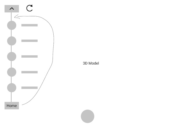
I used Figma to make some simple layouts and play around with the location and interactions of the UI.
TIMELINE MENU DESIGNS
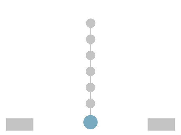
TIMER DESIGNS

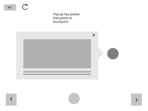
TOUCHPOINT POP-UP DESIGNS
HI-FIDELITY
TIMELINE MENU DESIGNS
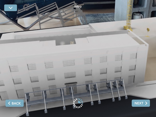
For the menu UI, we went forward with:
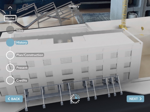
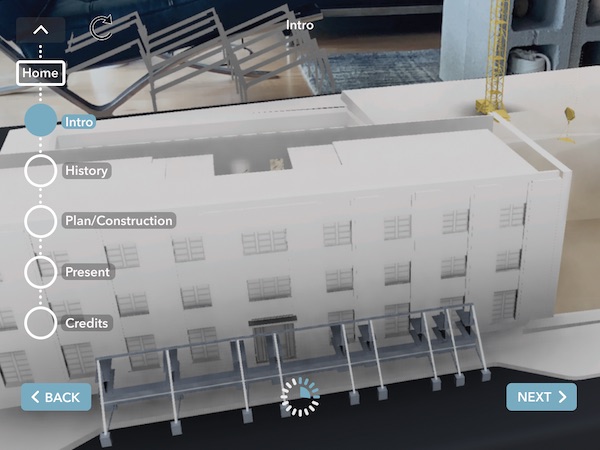
- a drop-down hamburger timeline menu that could be easily hidden so as to not interrupt the experience.
- the timer at the middle of the bottom part of the screen, since it did not need to be accessed often and could stay out of the way.
- Adding “back” and “next” buttons so that a person could easily move sequentially through the timeline.
Below is the final design for the menu closed, open, and at different sections.
I also created a timer animation in AfterEffects

TOUCHPOINT POP-UP DESIGNS
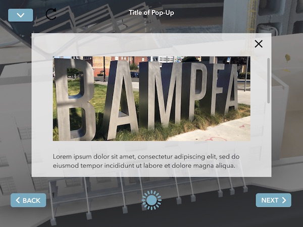
For the touchpoint UI, we:
- Made the pop-up take up the whole screen
- Darkened the background to make it easier to read
- Imagined the interaction as a fade-in, rather than a slide-in
Below is the final UI for it.

RESULTS & REFLECTION
The designs shipped to the app successfully, and the exhibit was opened in the BAMPFA in December 2019. Hundreds of visitors used the app to enjoy the exhibit visuals and learn more about the BAMPFA building’s history.
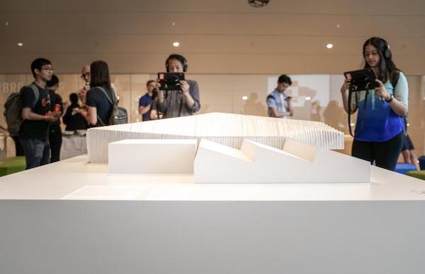
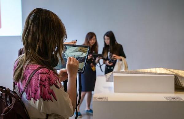
Museum visitors using the BAMPFA AR app to view the 3D model
While rushed, I got the experience of working closely with developers to produce a product and also working in the AR space for the very first time.
