THE REQUEST
We were asked to design a website that would represent their brand and digitally replicate the product showroom experience.
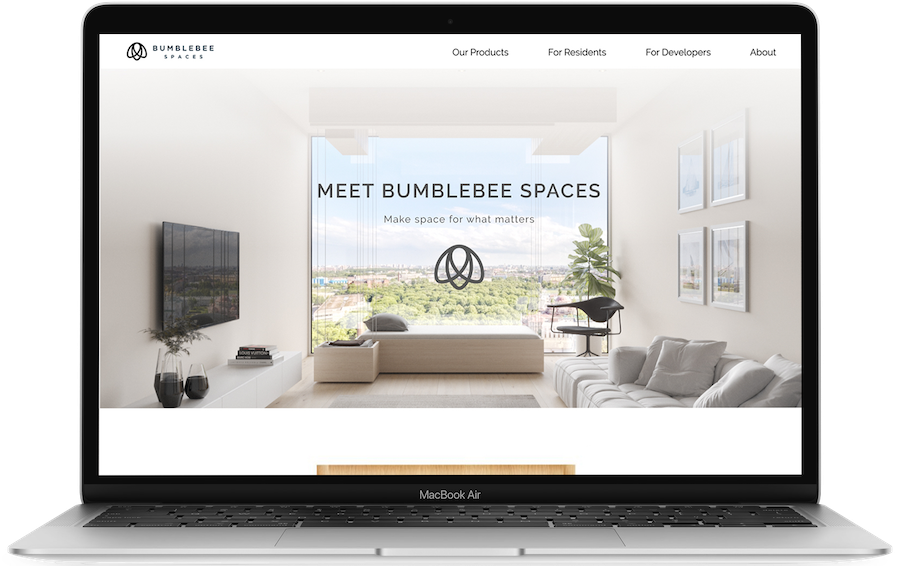
Designing the home website for Bumblebee Spaces, an innovative smart home and furniture company.
In my spring 2019 semester at UC Berkeley, I had the opportunity to redesign a website for Bumblebee Spaces as a design consultant under Berkeley Innovation.
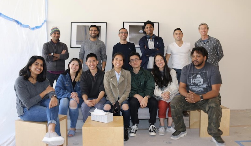
I worked with Serena Chan, Erika Jin, Justin Wong, and our mentor Tiger Fu to design a website that conveyed the story of the company’s product and the interactive product experience.
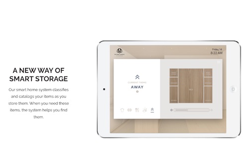
Bumblebee Spaces (now Bumblebee) is an SF-based start-up that uses innovative technology to turn living spaces into multi-functional smart homes. Their modular units make it easy to reconfigure a room and store belongings according to your varying needs across different times of day.
We worked with our client to identify our main stakeholders:
We then built a research plan and proceeded to execute the following.
We interviewed 2 landlords and 3 current beta Bumblebee Spaces users to better understand their perspective on the product and current content provided on the website.
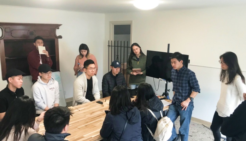
We brought in 9 current SF residents in their 20s to view the showroom and give feedback on the website in the Bumblebee Spaces office in San Francisco.
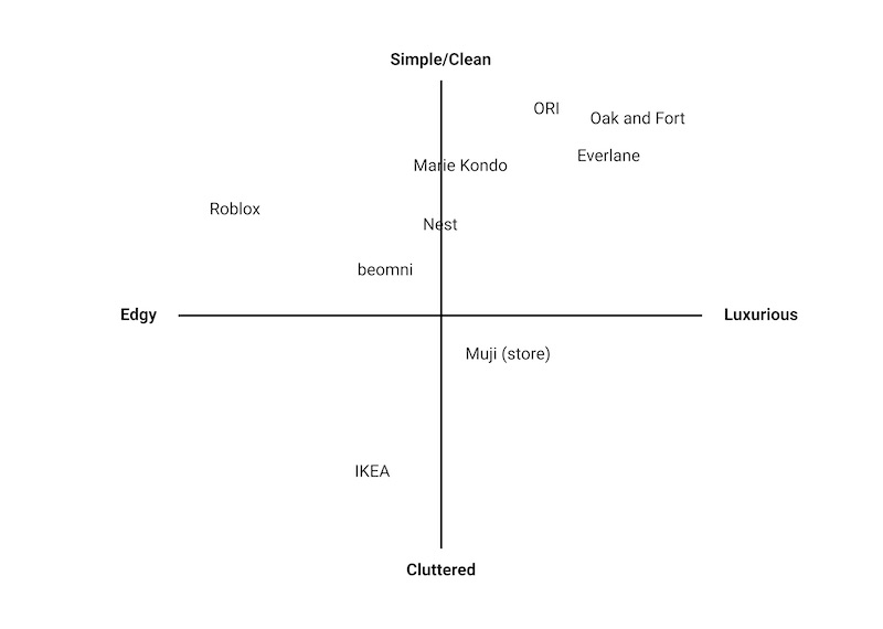
We conducted competitor analysis on home technology to understand how they represented their product digitally.
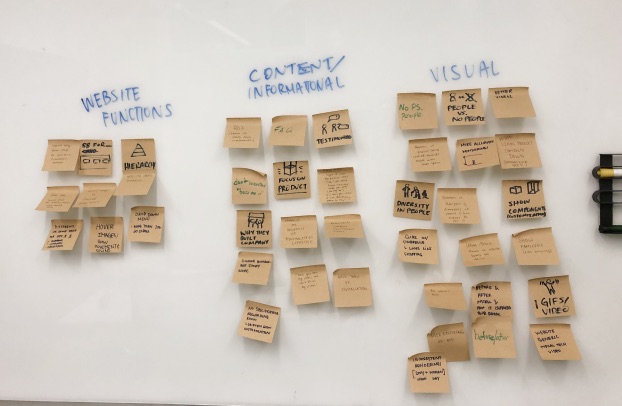
We took our main insights from research and did a brainstorm session on the different features and interactions to be included in the website. We then affinity mapped our ideas into 3 sections: website function, content/information, and visuals.
We also discussed what pages we would have and what information would be on each page, to ensure that we didn’t have too much repetition or unnecessary overlap between pages.
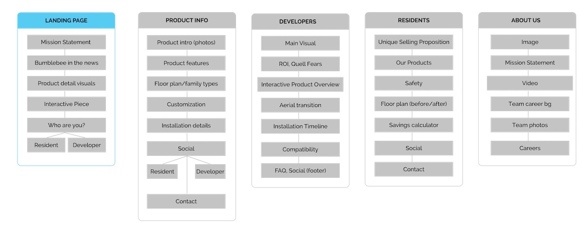
Ultimately, we felt that it was important to have separate information pages for the residents and developers because of their different interests.
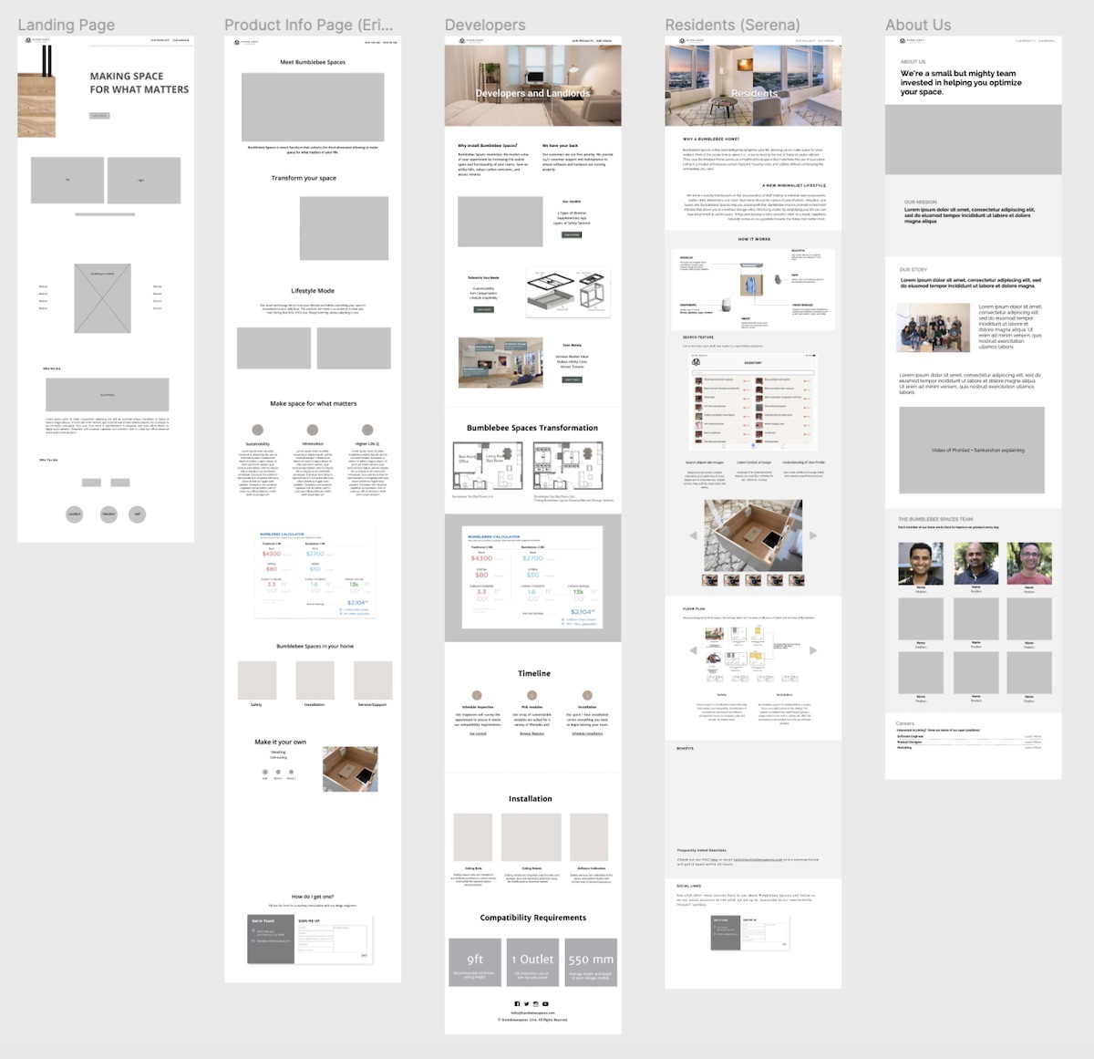
When it came to designing, we split up the pages to design within our team. I was in charge of the About Us page and landing page. Below are our mid-fi iterations of our pages and some color explorations.
We decided to do some further testing with the old website, particularly around word associations and product descriptions as we had been using the same descriptions from the previous site. We were also looking to get more input on not just what people thought of the product, but what would make them interested in buying it.

We used UserTesting.com to interview 12 users ranging from ages 25-60 and with incomes of $40k+. tested some of the word associations we had been using, such as “robot assistant”, “smart home”, and “smart storage”. From our testing, we found:
After reviewing the results of our user testing, we decided to rethink how we were approaching the design and content of our pages.
We rephrased our copy to use the words “smart” when describing any part of the product.
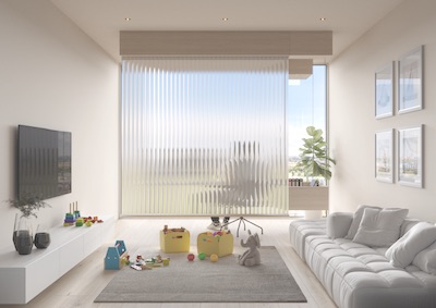
We decided to change the landing page and residents pages so that they had more imagery and less specific technical information.
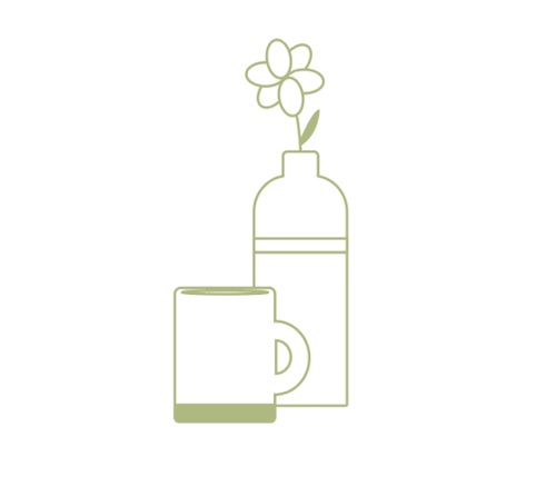
I made some simple line-art illustrations to make the website and product feel more casual and familiar, rather than an unreachable tech product.
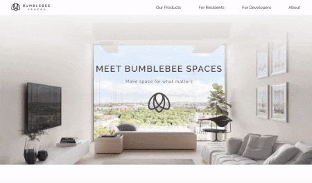
This page highlights the main features of the product and the lifestyle it can afford a person. We tried to feature more contextualized images and videos showing the product in everyday use.
The product page focuses on all of the specific design elements and technological aspects of the product itself.

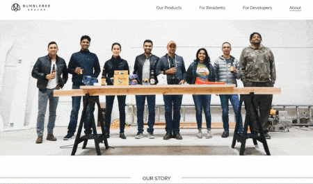
The About Us page shows the main mission and goals of the company as well as the people behind it. It also houses the career section.
The residents page goes into the specifics of the lifestyle afforded by bumblebee. It also features the savings calculator, that shows how you can save overall as a result of installing Bumblebee.

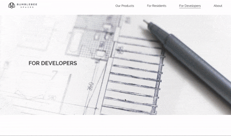
The developer’s page is more technical than the residents, and instead focuses on the ROI and general process of installing, as well as the product specifications.
We decided to go with a light theme to match the light wood color of the product, and paired it with a muted green. The goal was to make the website feel clean, welcoming, and homey.
My main takeaways from this project were:
Overall, our team was well-balanced and able to utilize the strengths of each member well during the project. It was my first time working in a fast-paced tech start-up environment, so it was interesting to learn about the processes that happen to create and release a new product. If we had more time, I would have loved to spend more time prototyping the website interactions to further replicate the experience of a showroom.